







Challenge
Project Goals:
A UK-based entrepreneur approached us to create a distinctive functional loose-leaf tea brand for active, health-conscious consumers.
The challenge was to enter a crowded tea and wellness market with a product that felt energetic, modern, and performance-driven rather than traditional or overly medicinal. The brand needed to communicate natural ingredients and functional benefits while standing out both online and on the shelf.
The visual identity also had to support several different blends, allowing each product to have its own character while remaining part of one recognizable and scalable brand system.
Strategy
We positioned Pre Tea at the intersection of natural wellness and active performance.
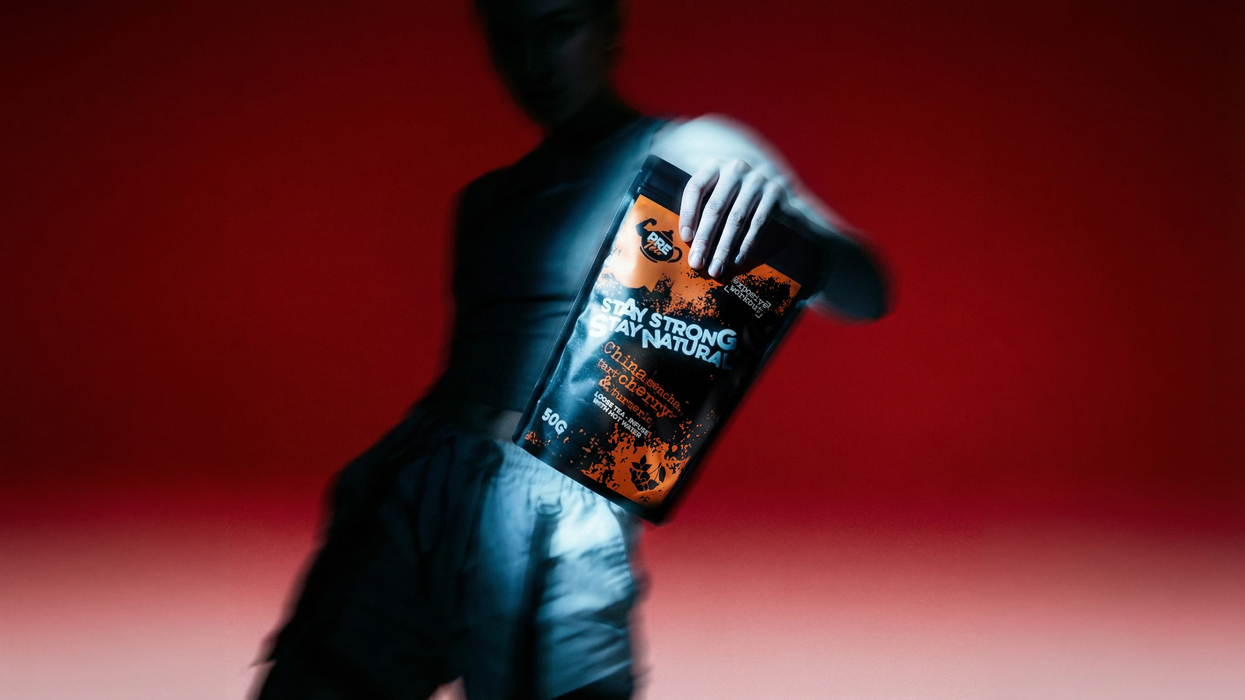
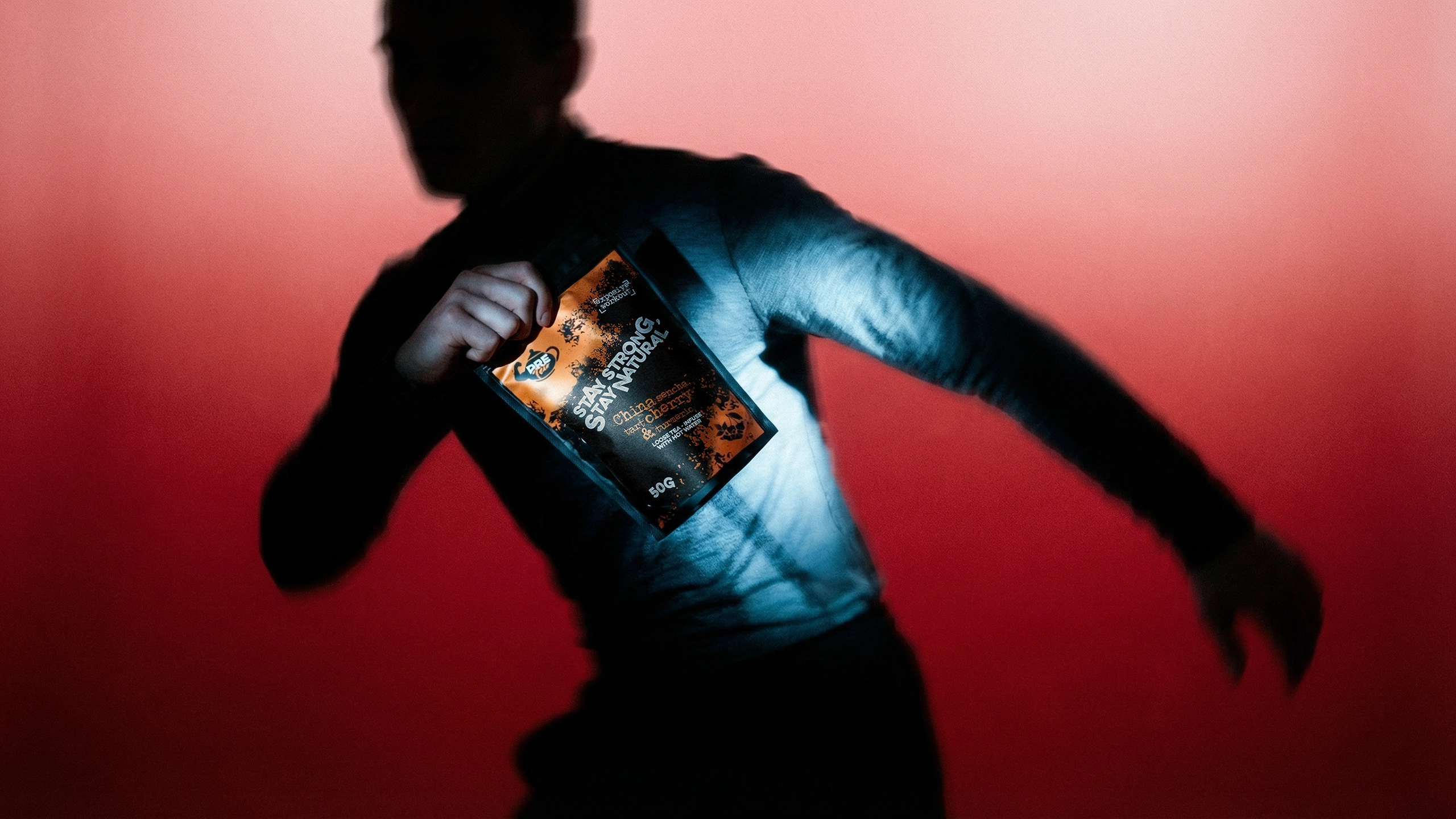
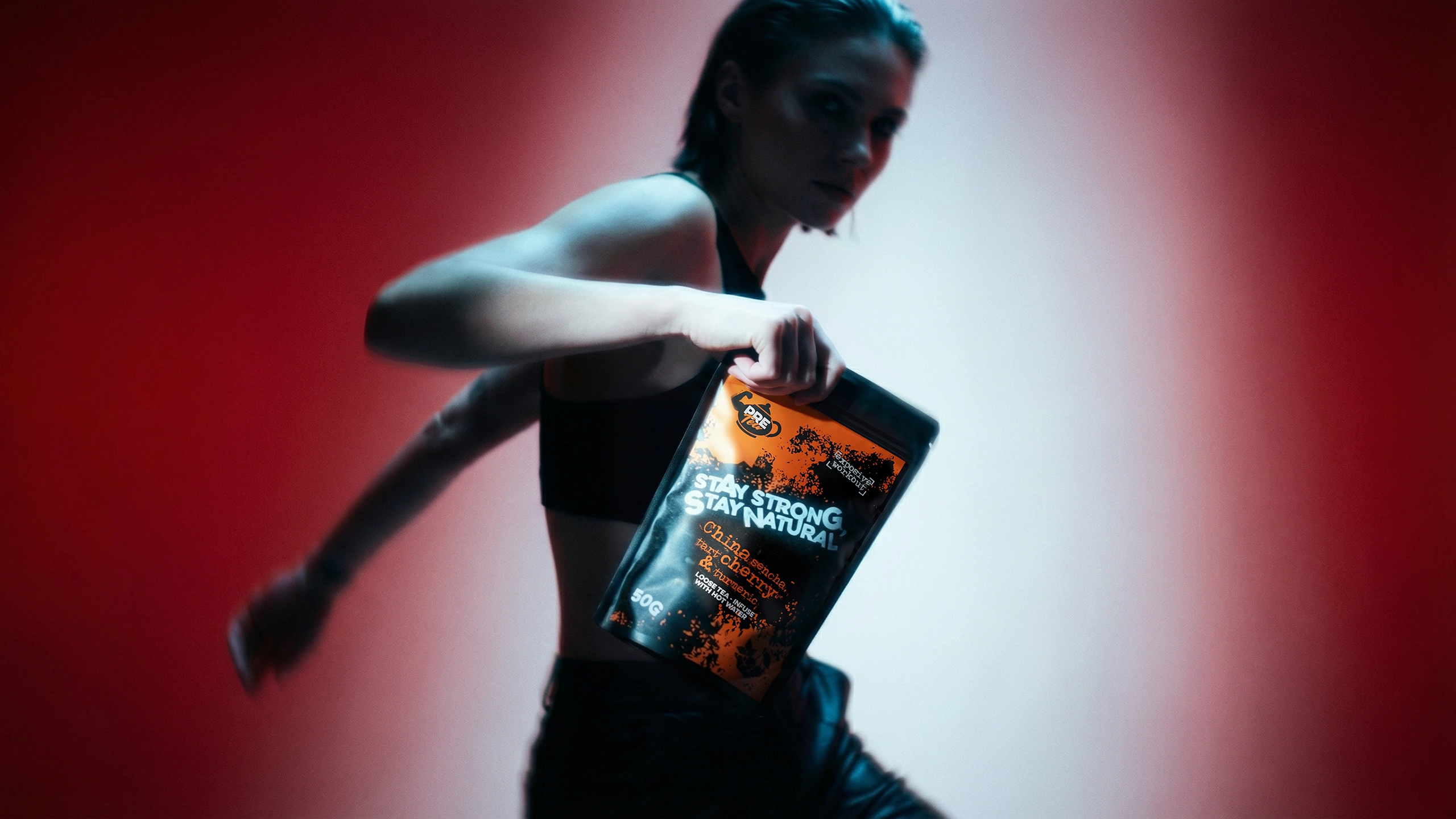
Instead of following the calm, traditional visual language commonly used in the tea category, we created a bold and expressive identity inspired by movement, training, energy, and contemporary urban culture.
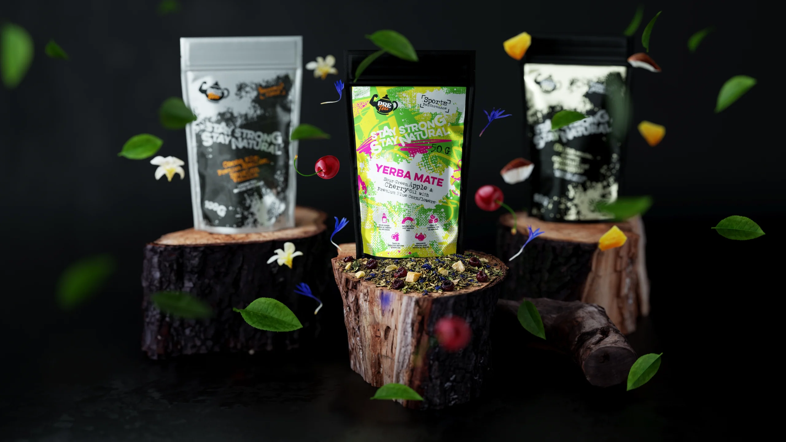
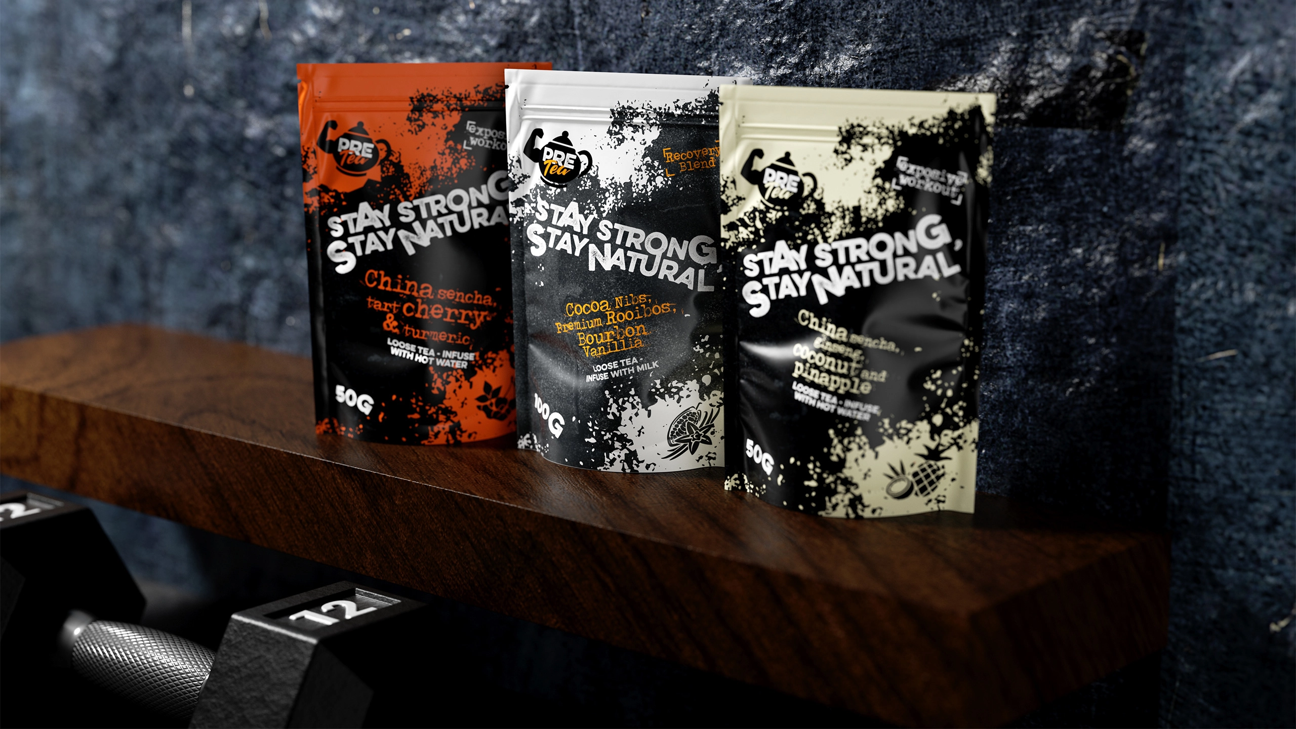
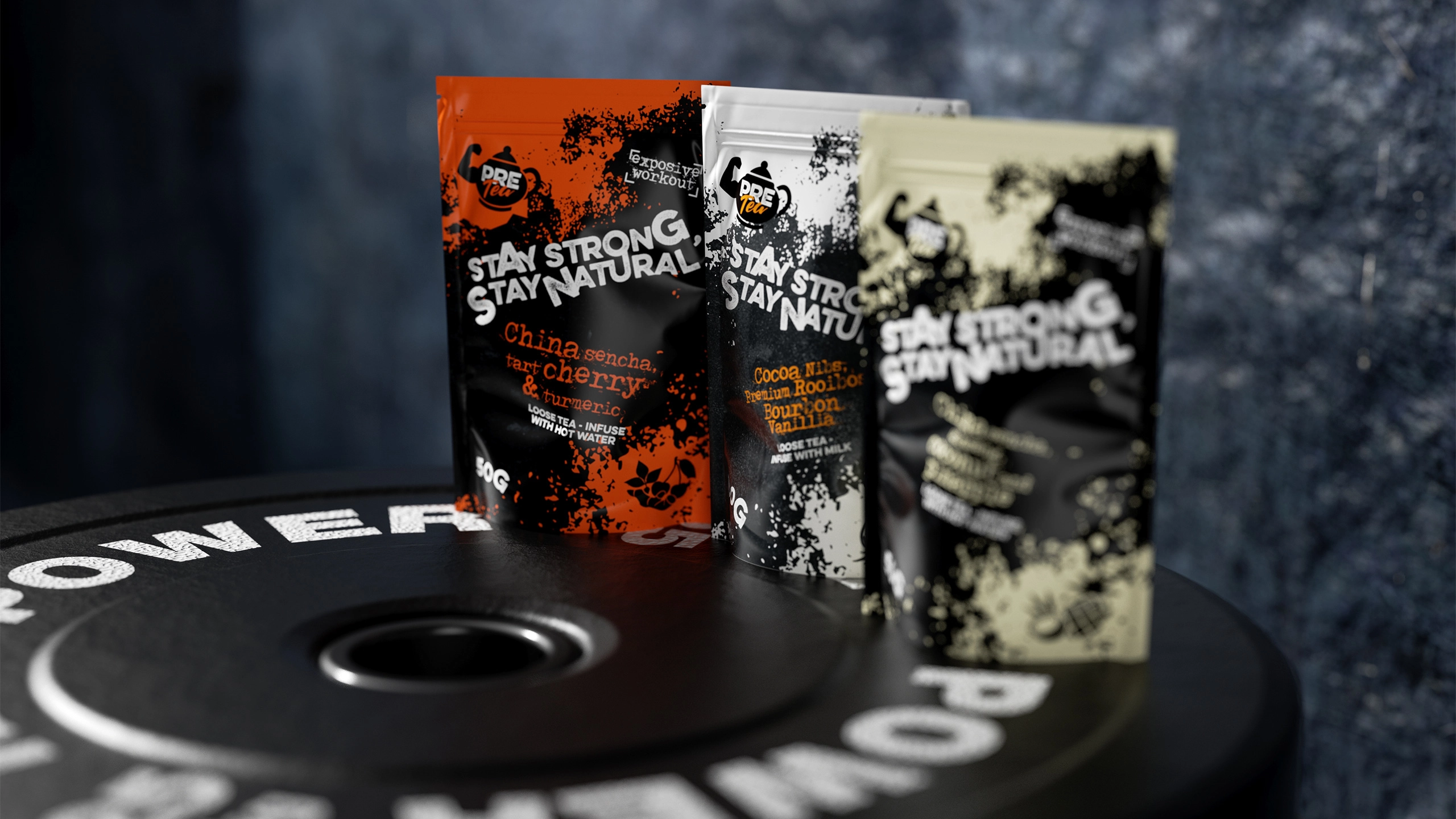
The product range was organized around clear functional occasions, including pre-workout energy, recovery, and everyday performance. High-contrast colors, dynamic graphic textures, expressive typography, and clear ingredient communication helped each blend stand out while maintaining consistency across the entire range.

Amazing work, always impressive and improves the look of my brand hugely.
Solution
The solution included:
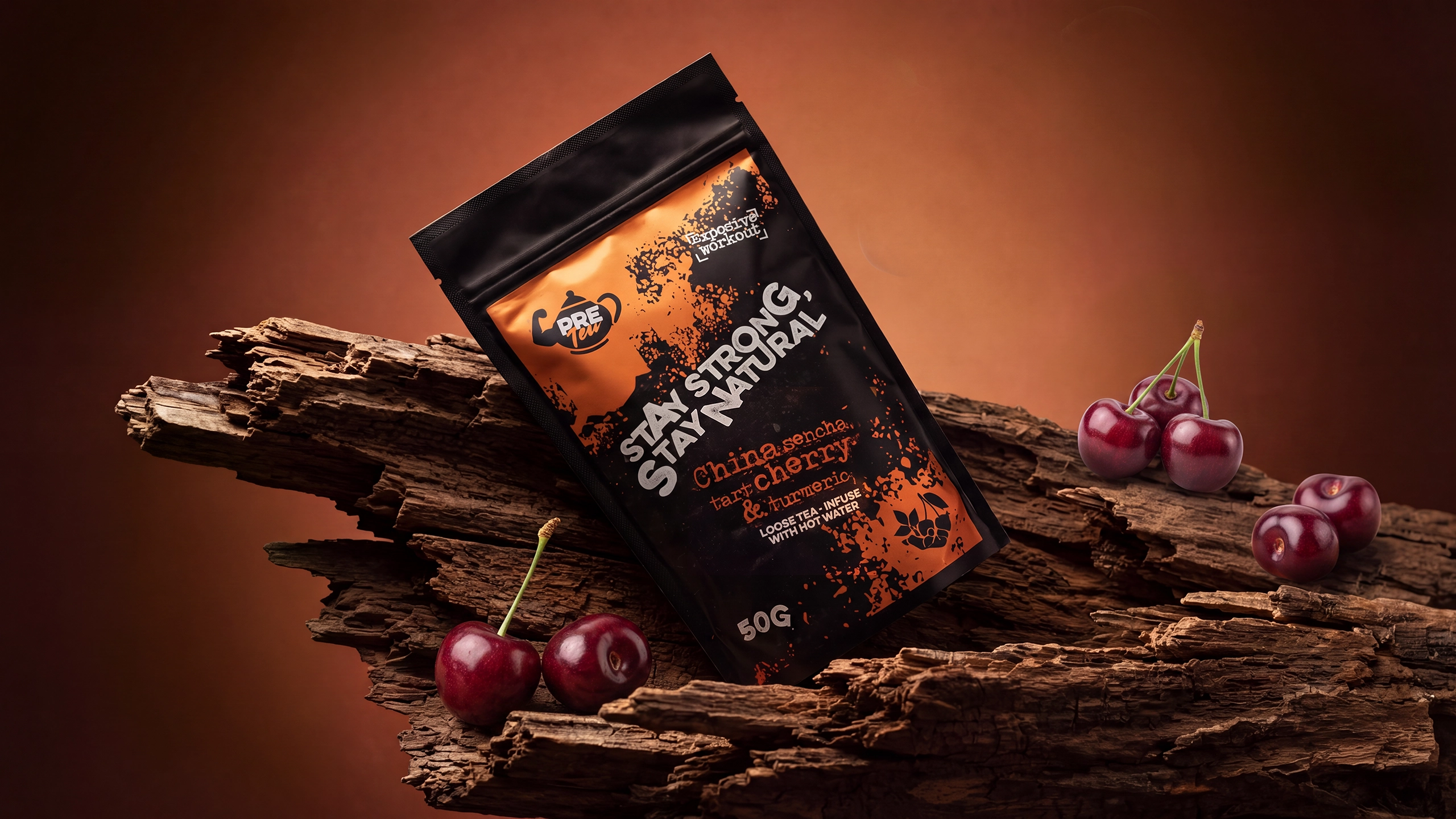
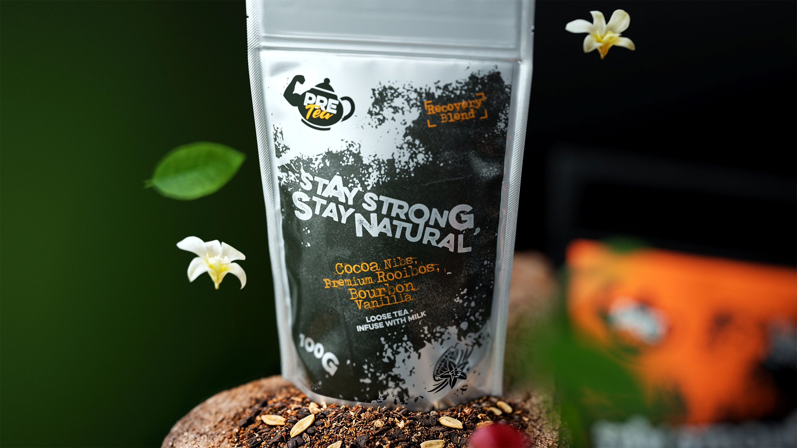
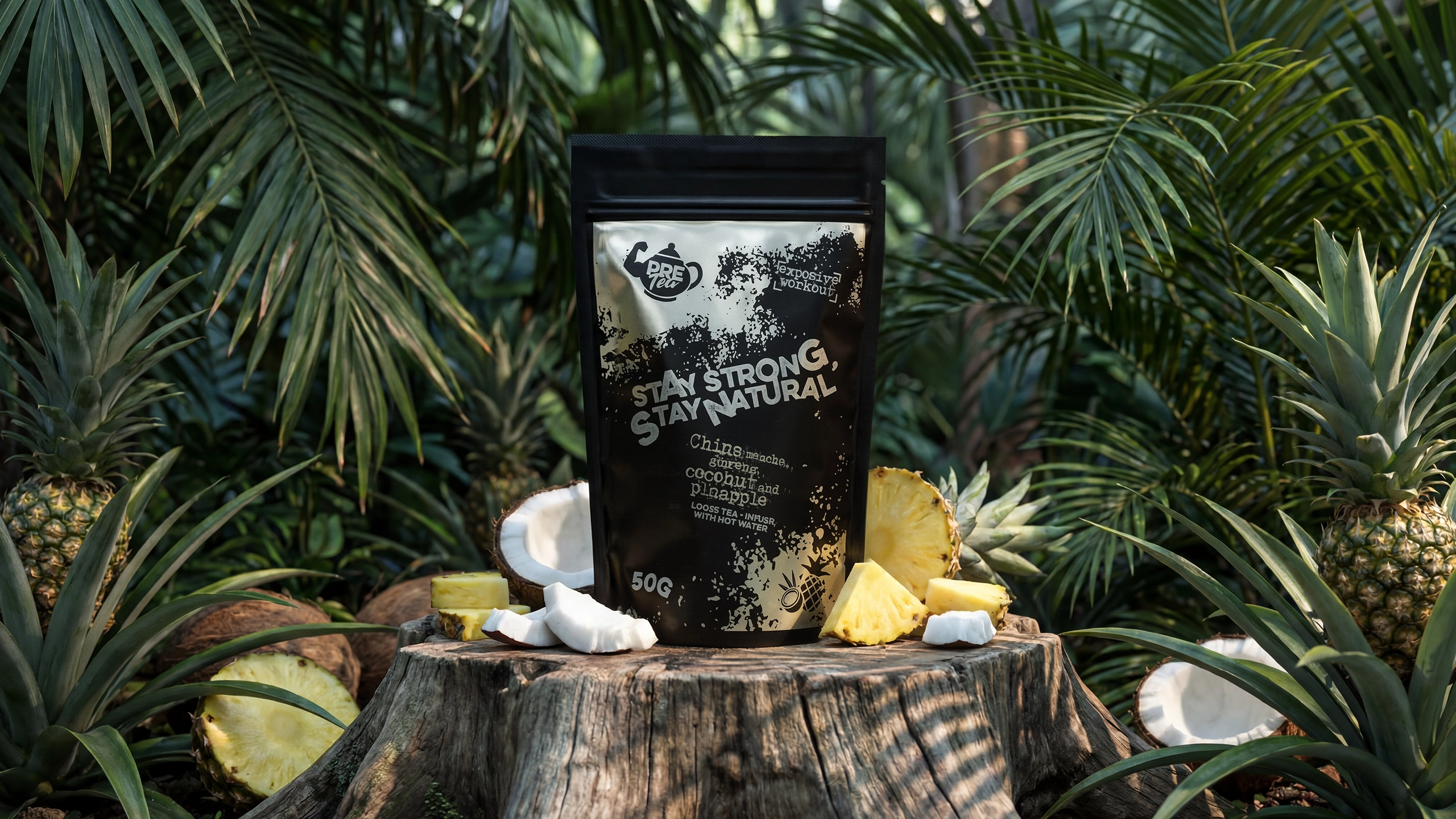
Developing the Pre Tea brand identity and creating a flexible packaging system for a range of functional loose-leaf teas.
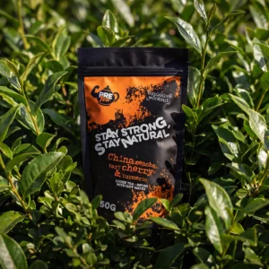
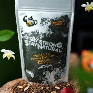
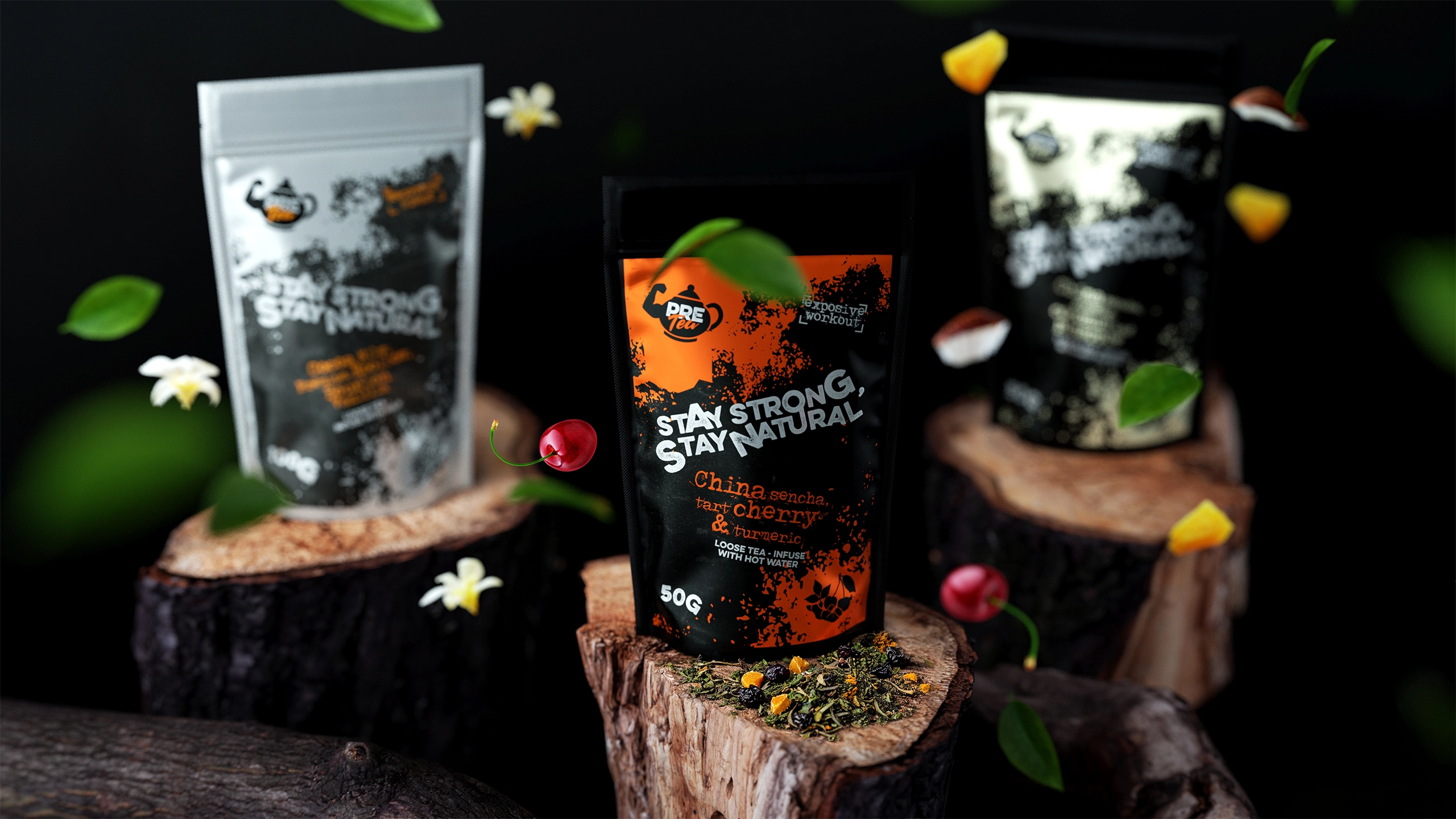
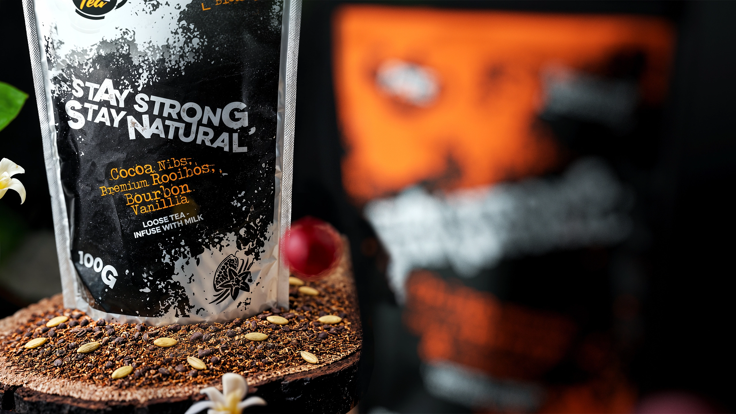
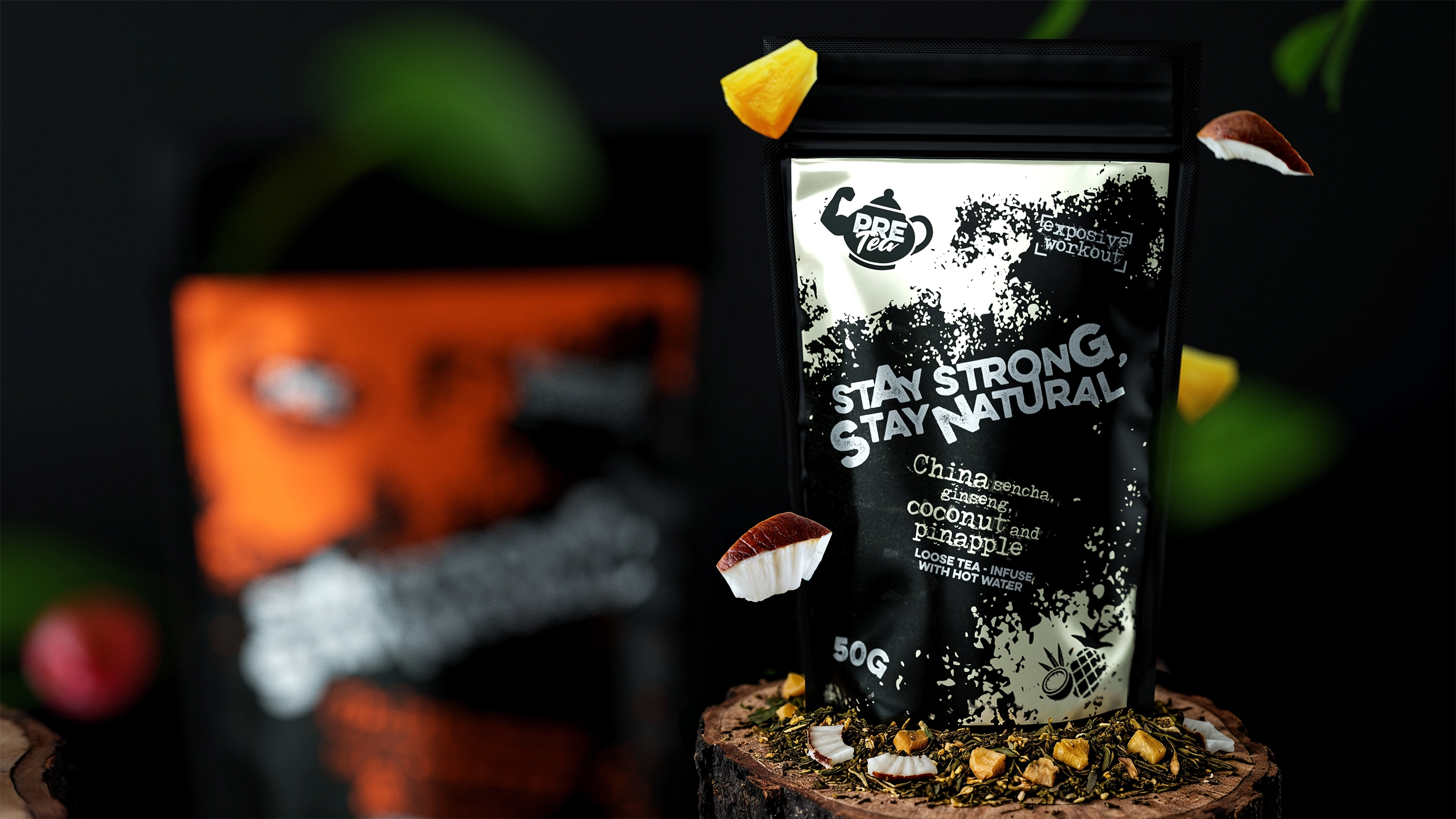
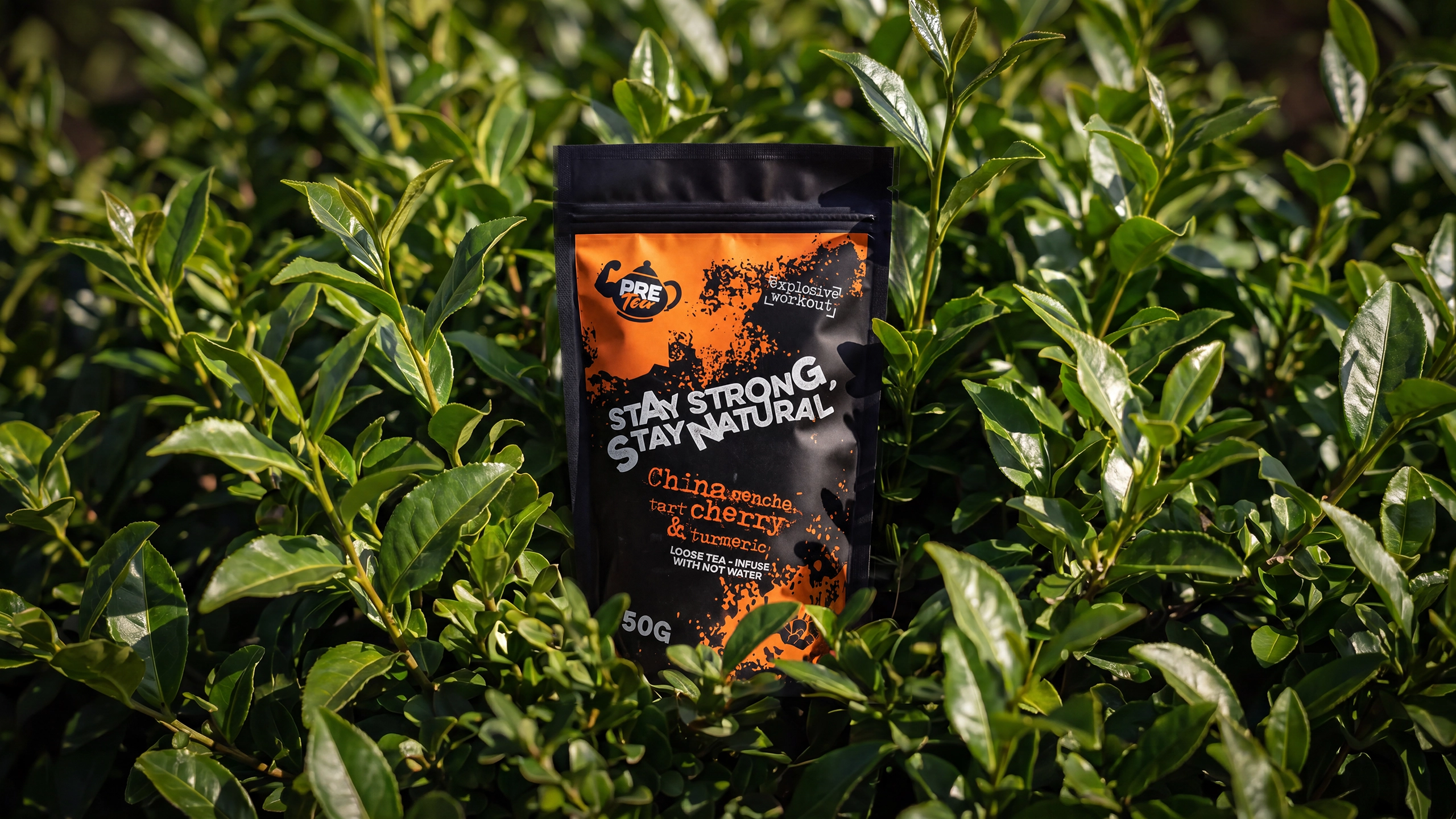
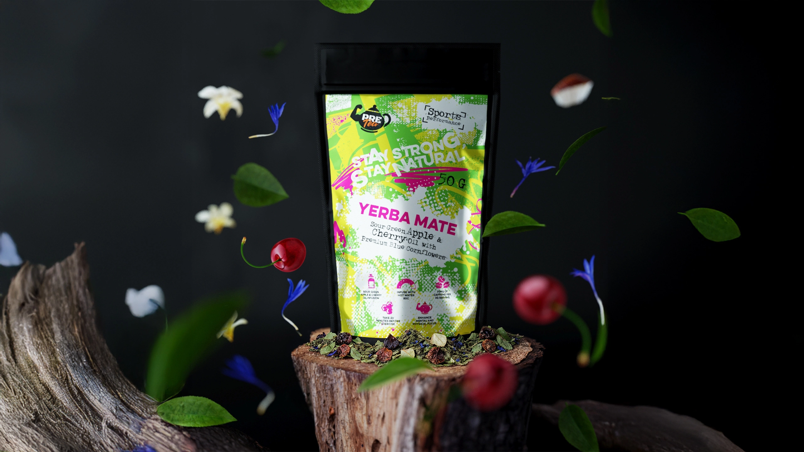
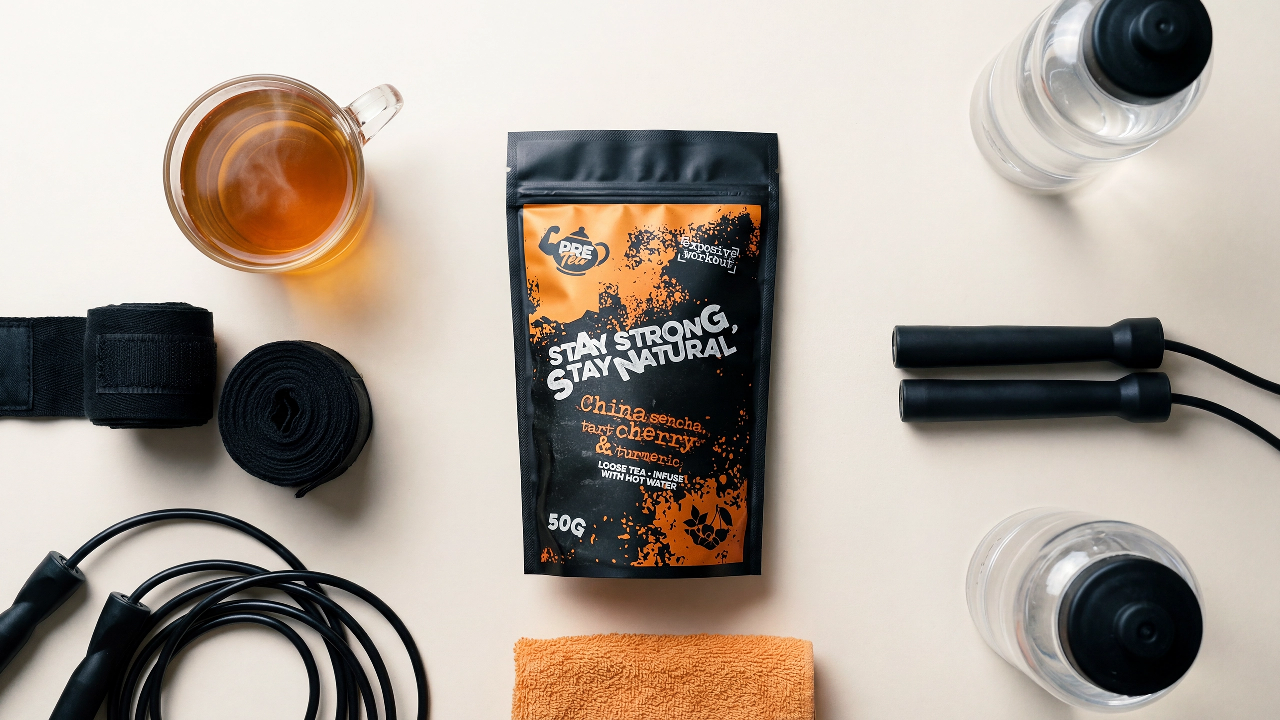
We designed a recognizable master brand supported by individual color palettes and product messaging for each blend. The packaging combined strong shelf impact with clear information about ingredients, functional benefits, weight, and preparation.
Expressive typography, energetic graphic textures, bold contrasts, and unconventional compositions reflected the performance-focused personality of the brand. Each package was given its own visual character while following a consistent structure that made the entire product line immediately recognizable.
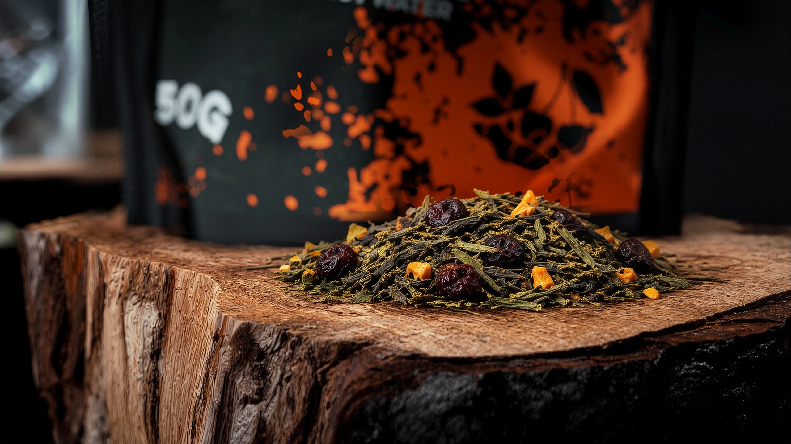
The resulting system was designed to work across packaging, e-commerce, social media, product photography, and future brand extensions.
Results
Pre Tea successfully moved from concept to commercial launch in the UK.
The distinctive packaging helped the products stand out in the crowded tea and wellness category, while the clear product architecture made the range easy for customers to understand.
The products achieved strong early sales, confirming that the positioning and visual identity resonated with the target audience. The final brand system gave Pre Tea a strong foundation for expanding its product range, strengthening its online presence, and developing future marketing communications.
Team
- Dmytro Lynnyk
- Creative Director
- Iryna Lynnyk
- Brand Strategy Director