


Challenge
The challenge was to establish a soothing and memorable visual identity for a mattress brand that not only conveyed comfort but also set the brand apart from competitors. The goal was to create a logo and branding that embodied the essence of restful sleep while appealing to the target audience’s desire for quality and relaxation.
Strategy
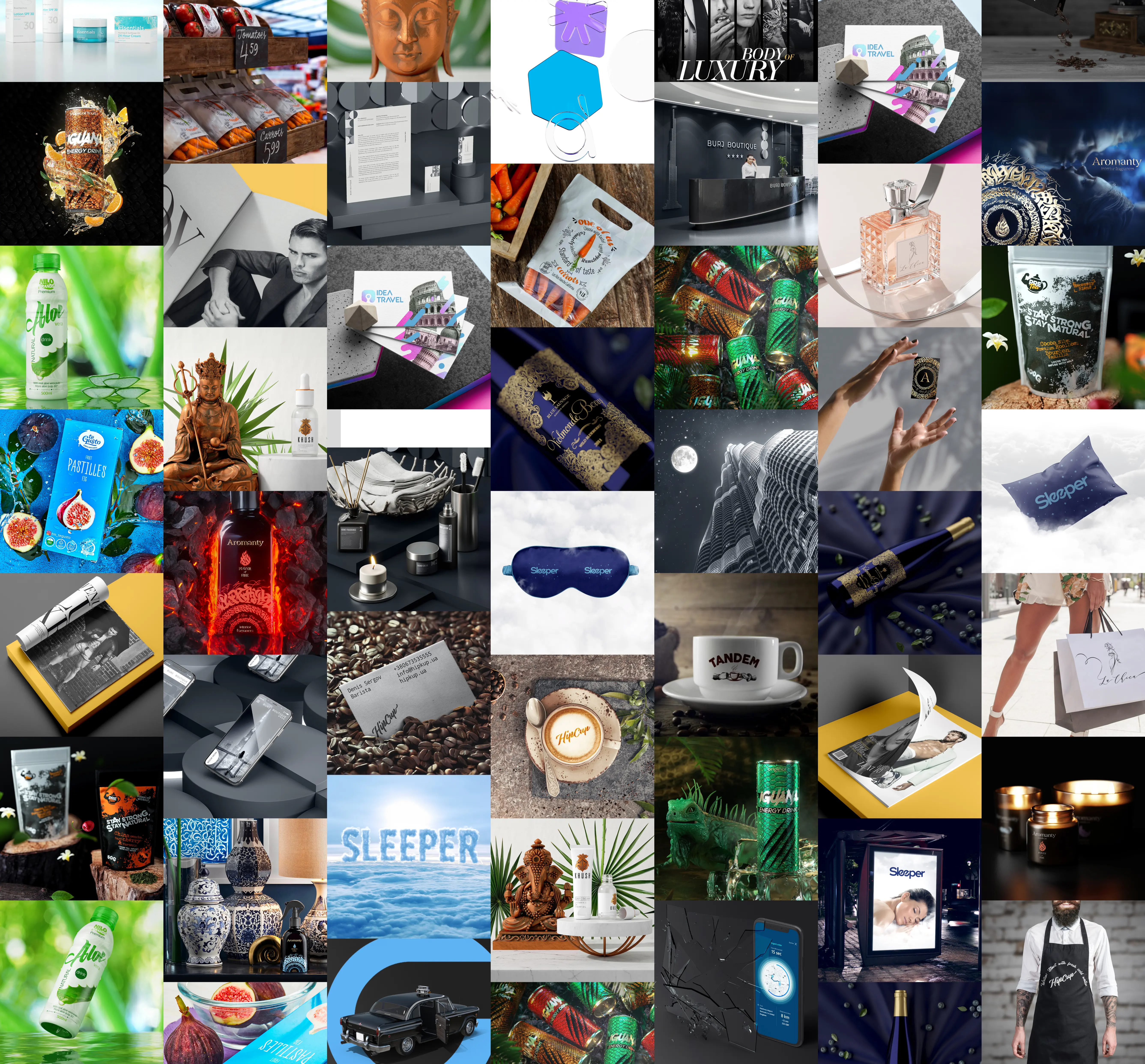
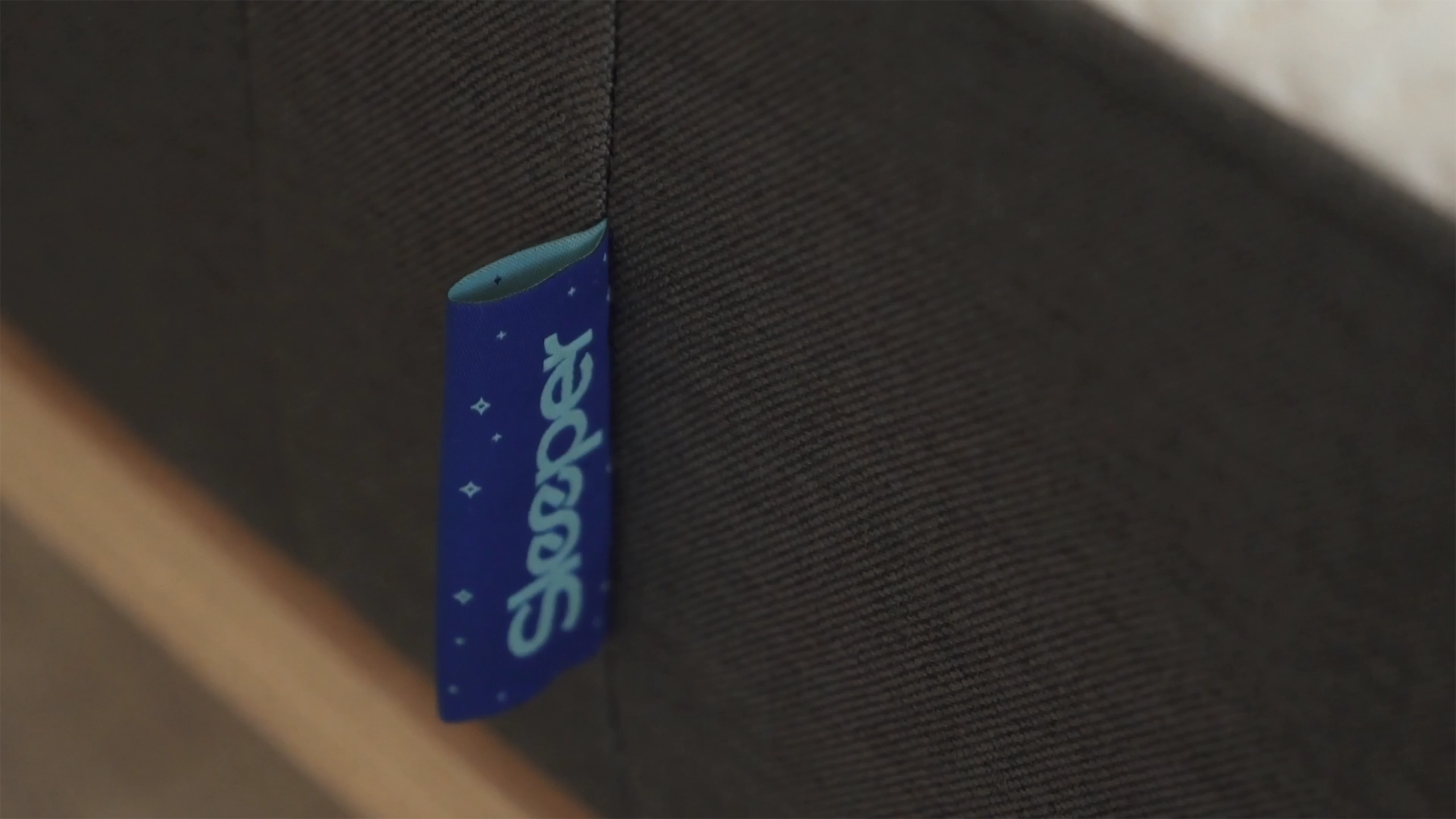
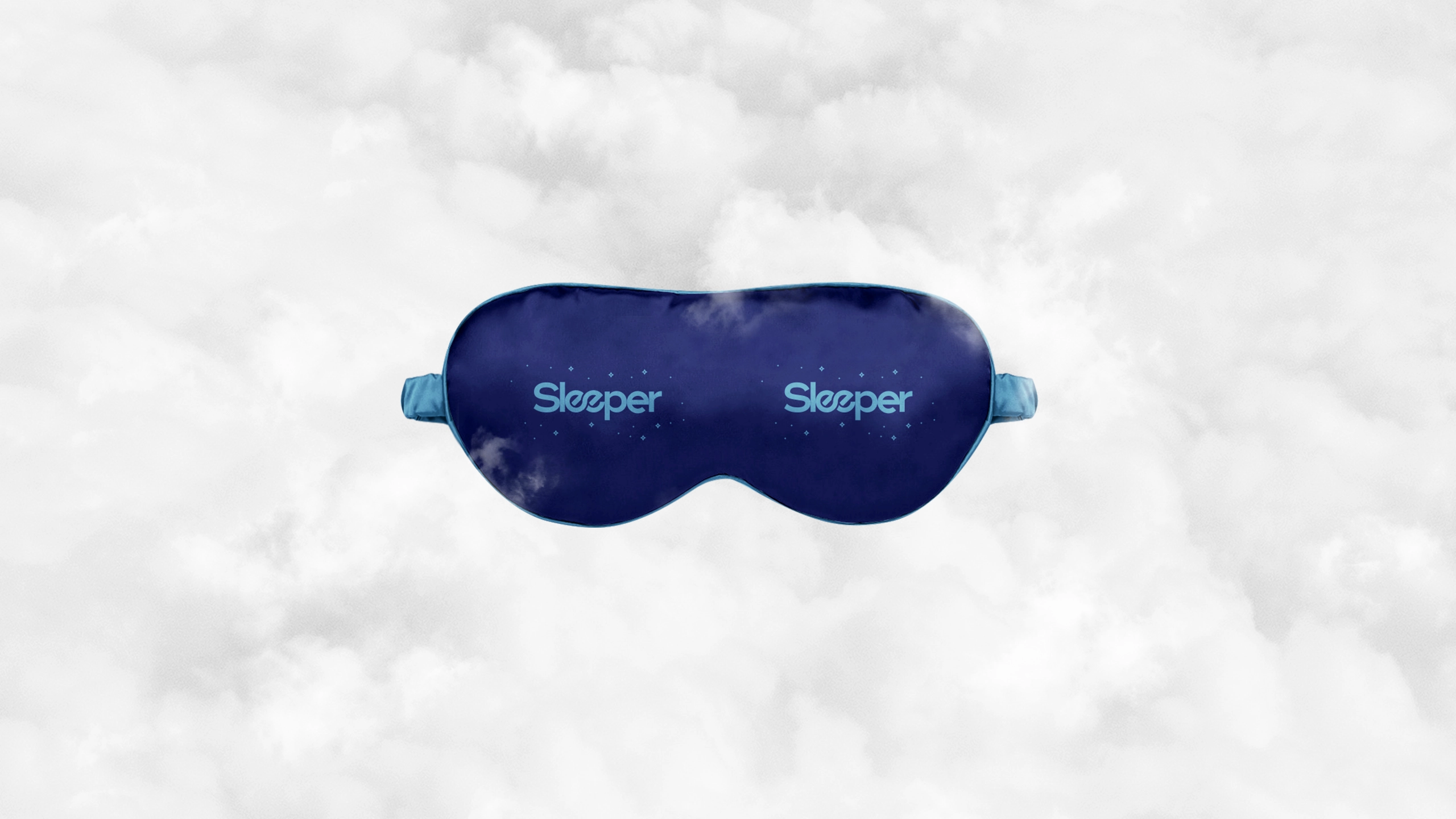
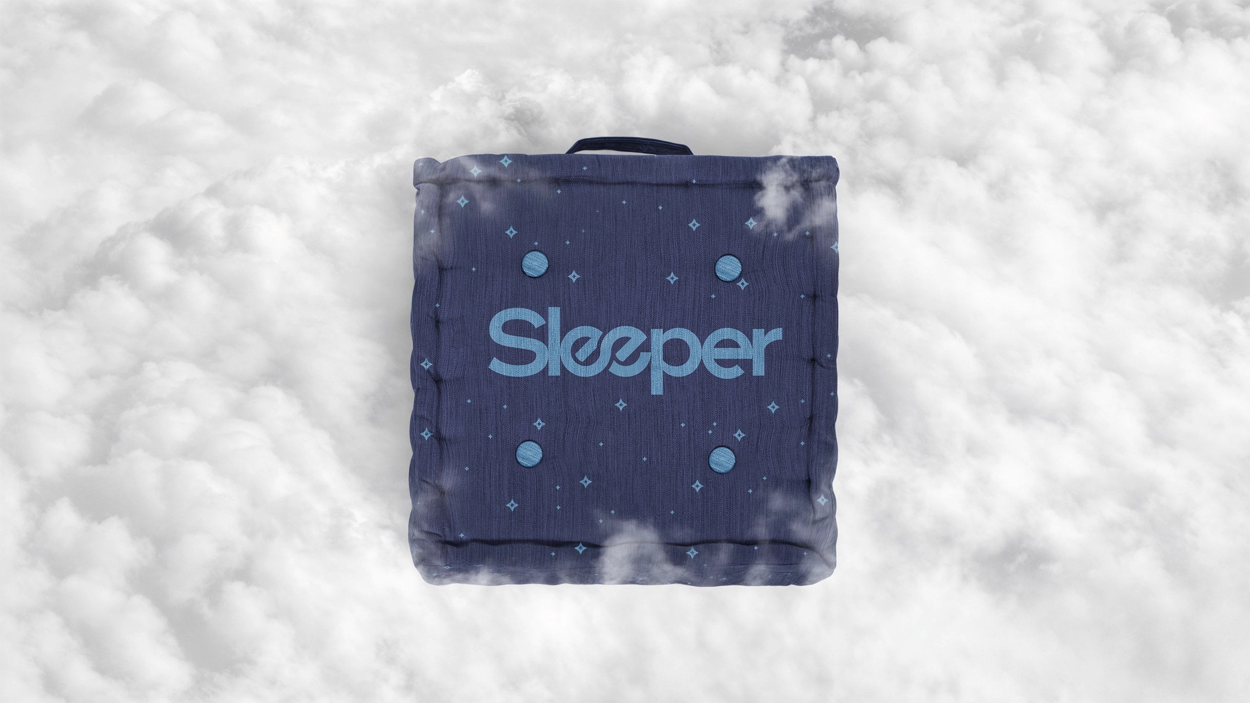
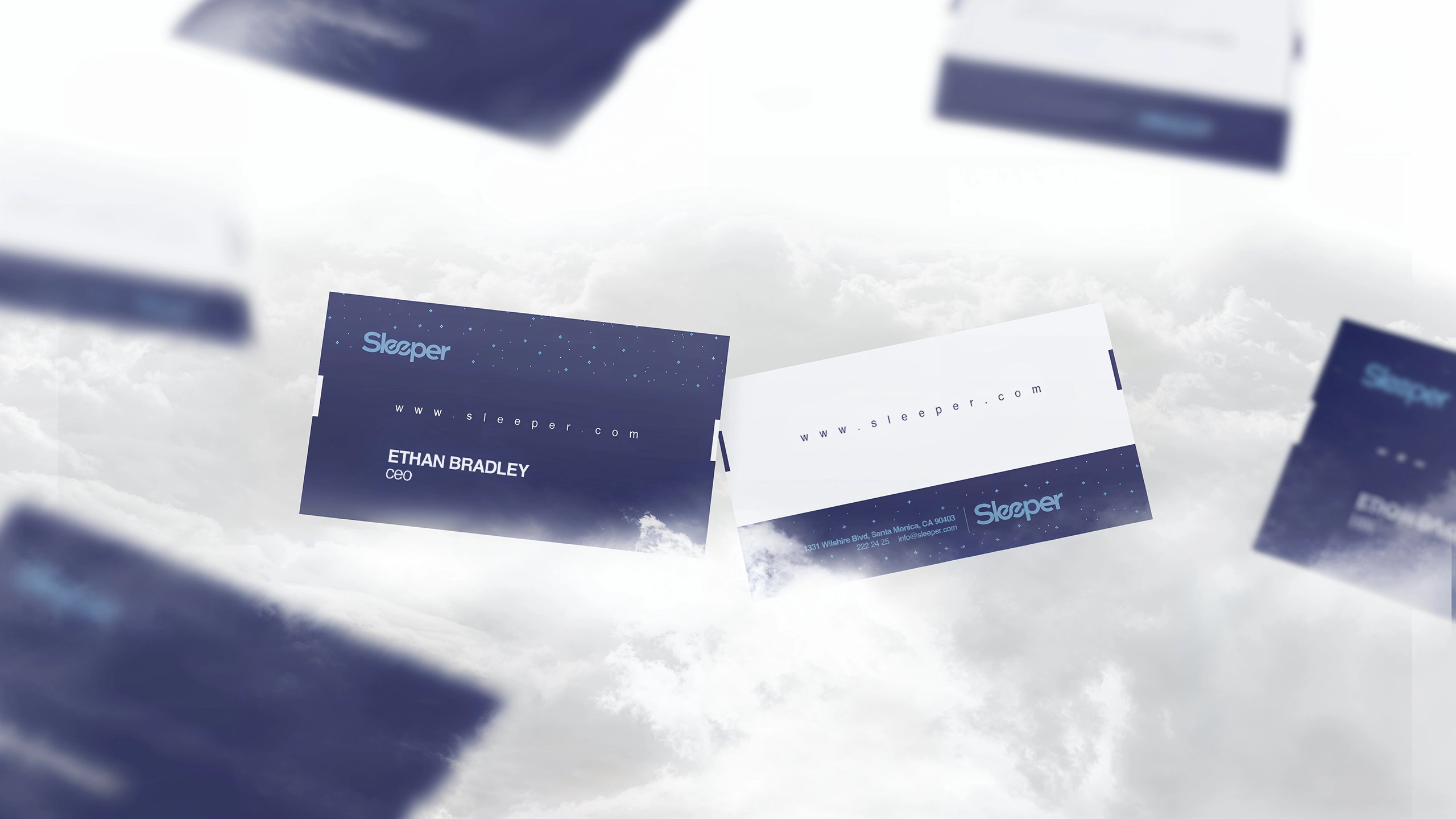
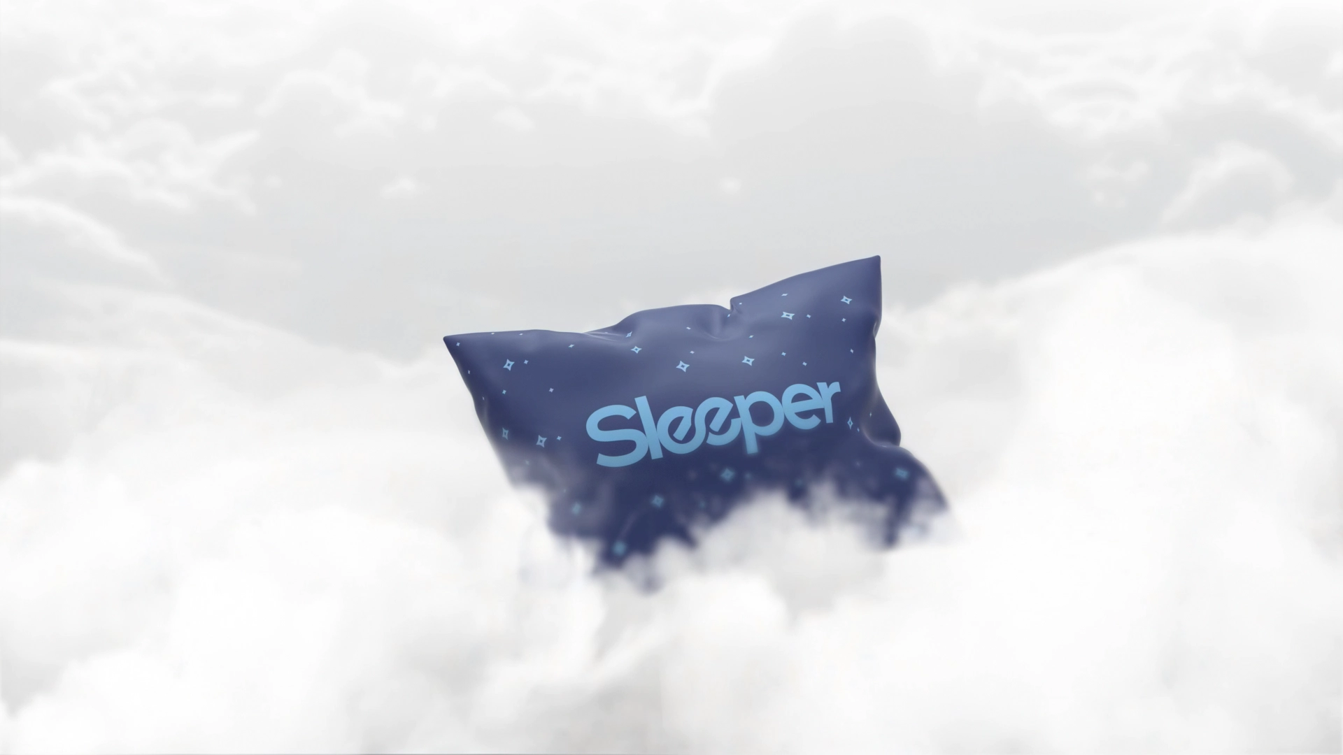
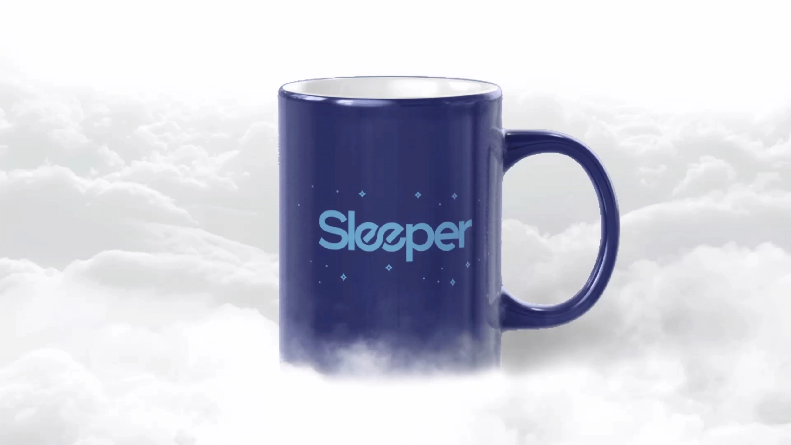
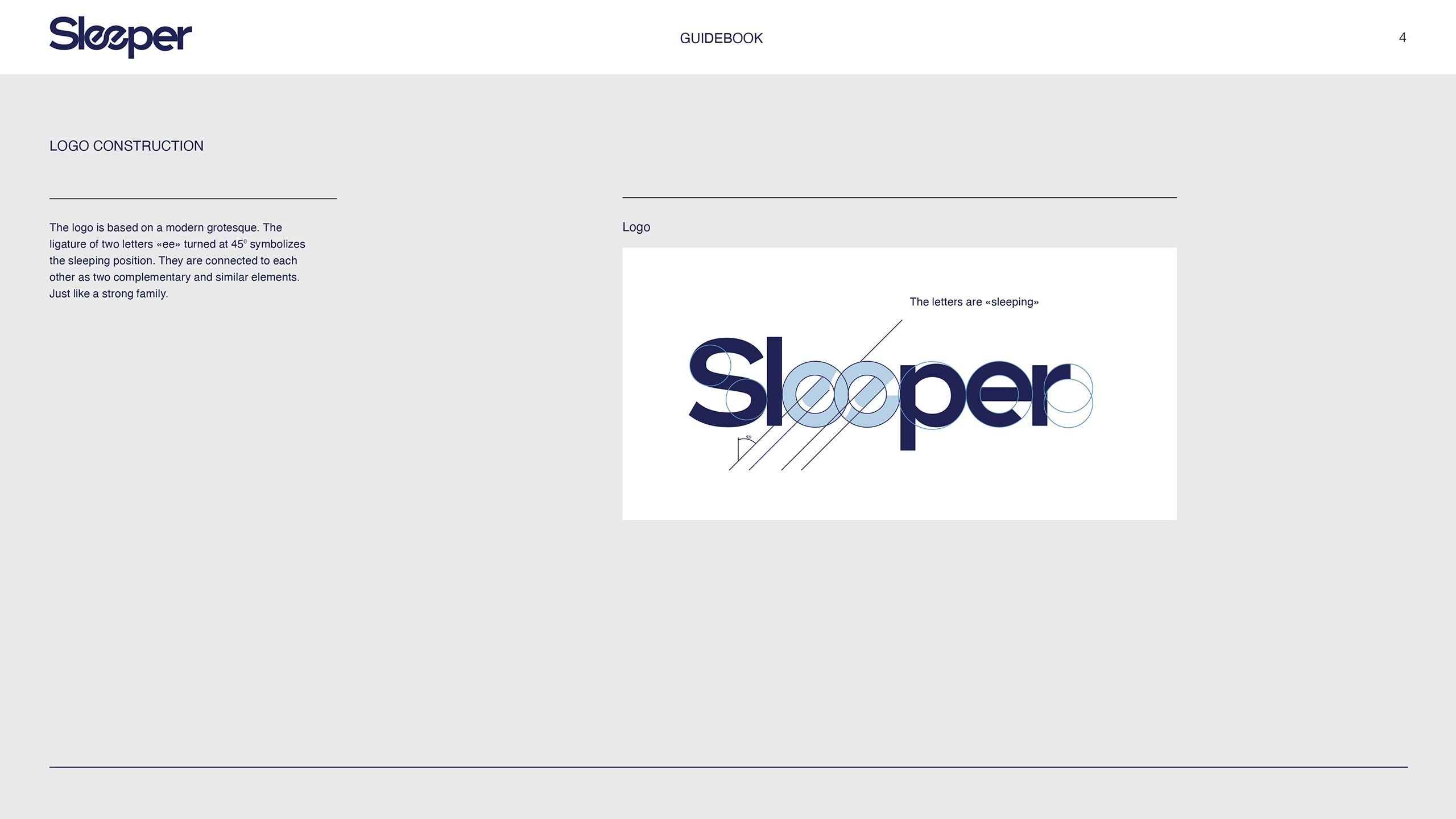
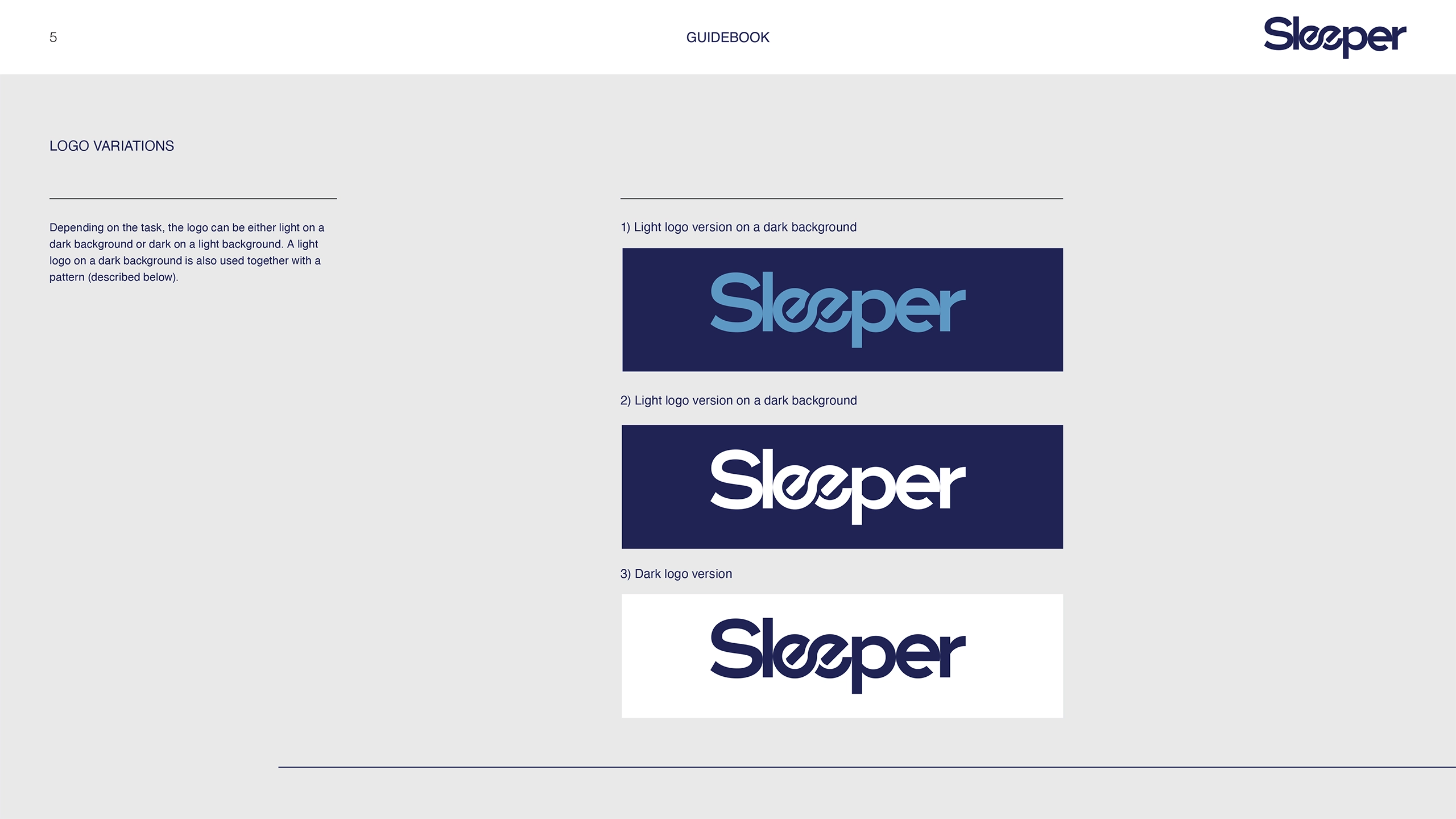
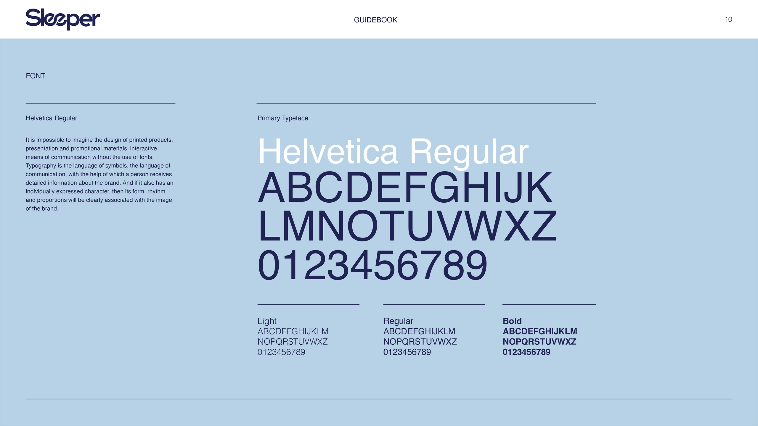
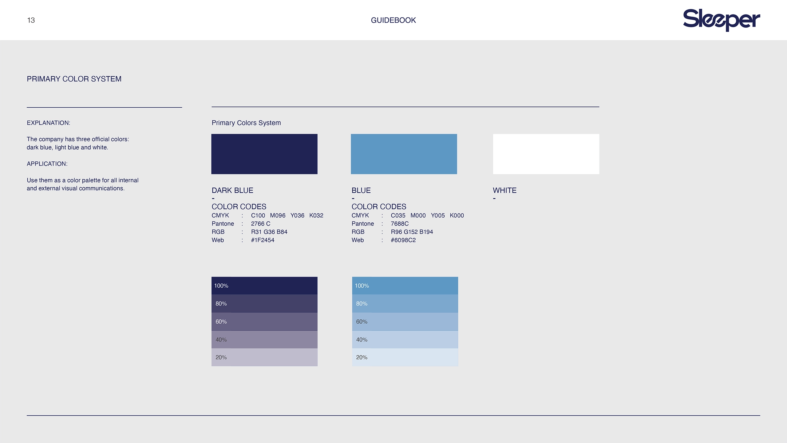
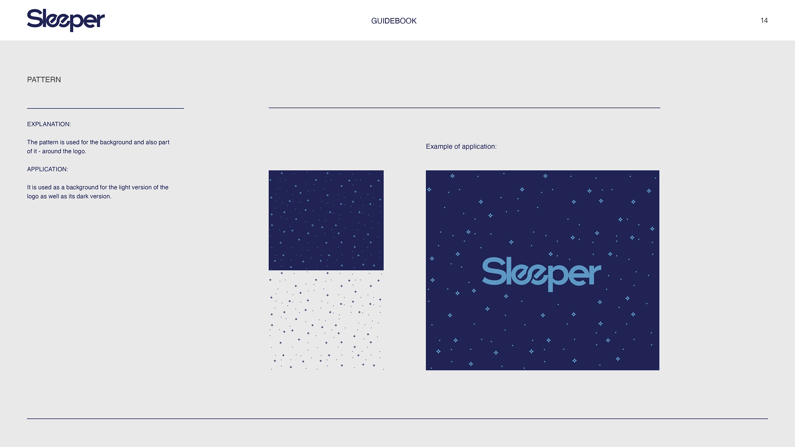
To achieve this, we developed a logo featuring a clever combination of the letters "e" and "e," rotated to appear as though they are lying down, evoking the imagery of a sleeping pair. This symbol reinforced the brand's focus on sleep and comfort. The branding was complemented by a serene blue and light blue color palette, carefully selected to evoke a sense of calmness and trust. The overall design reflected the sensation of sleeping on clouds—soft, light, and effortlessly comfortable.
Solution
The final branding was light and airy, with an emphasis on simplicity and comfort. The logo and color palette harmonized with the concept of restful sleep, while the overall design ensured a consistent and recognizable identity. The brand’s visual language communicated a promise of softness and serenity, perfectly resonating with the core values of Sleeper.
Results
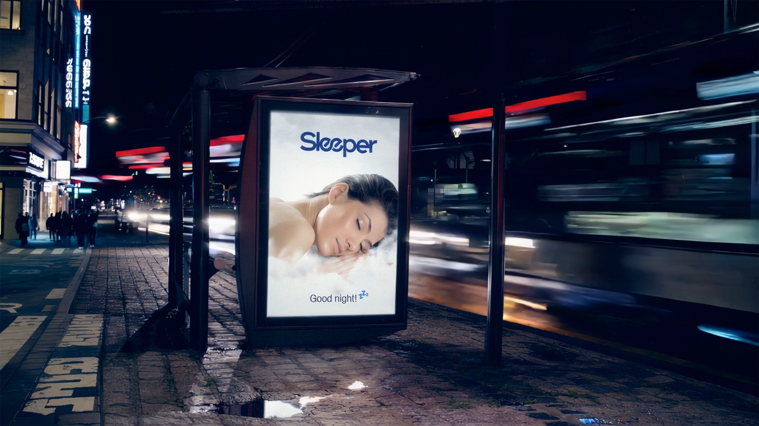
The new branding helped Sleeper establish a distinctive presence in the highly competitive mattress market. Customers praised the design for its calming aesthetics and memorable elements, while the cohesive brand identity enhanced recognition and trust among the target audience.
Team
- Dmytro Lynnyk
- Creative Director
- Iryna Lynnyk
- Brand Strategist
- Olena Sukhinska
- Project Manager
- Eugene Kukharskyi
- Motion Designer